When you think of Oshkosh Airport Products, for many, the first thing that pops into your head is bad-ass equipment. In fact, their equipment is world-renowned for being tough, dependable, innovative, and second-to-none. These were some of the traits we wanted to convey when we were approached by Oshkosh Airport Products to redesign their website.
Oshkosh Airport Products produces industry leading apparatus for airports and municipalities. Just like their parent company Oshkosh Corp., they make rugged equipment that needs to perform in a variety of different environments: from airport fire emergency response to runway snow removal in the harshest conditions.
During our initial discussions with Oshkosh Airport Products, we were all in agreement; the number one area of their website needing serious improvement was how their equipment was being presented visually. The tiny thumbnails in their old templates didn't accurately convey the scope and scale of their operations or equipment.
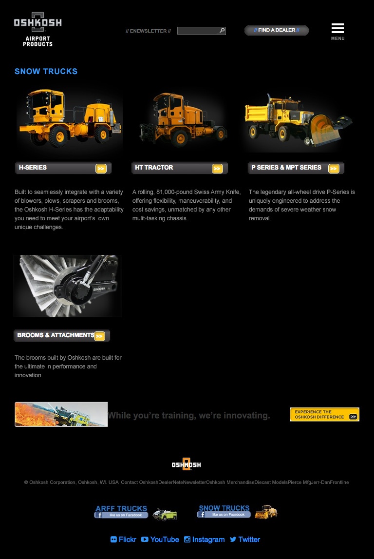
Old template design
As we discussed the project further, we were pleasantly surprised to find out Oshkosh Airport Products had already began to address this issue. They recognized the importance of investing both time and resources into photography.

Kick-Ass Equipment
With this photo gallery in our back-pockets, we began our typical wire framing process.
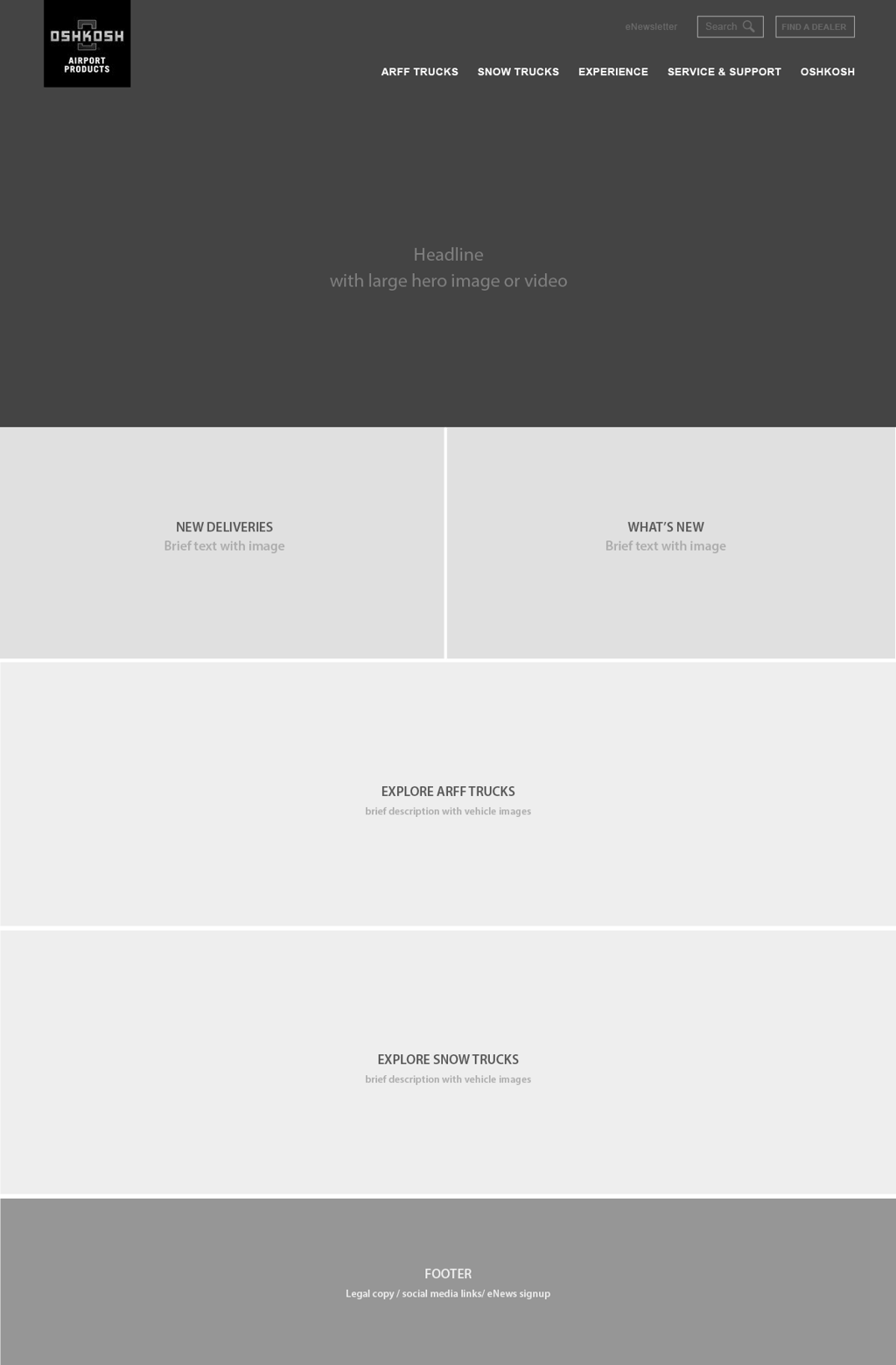 Initial Black-and-White Wire Frame
Once the wire frames were approved, we began working on our full-color comps in Photoshop. As part of this process, we begin to identify the custom modules that would be beneficial to Oshkosh Airport Products as well as the features included in those modules.
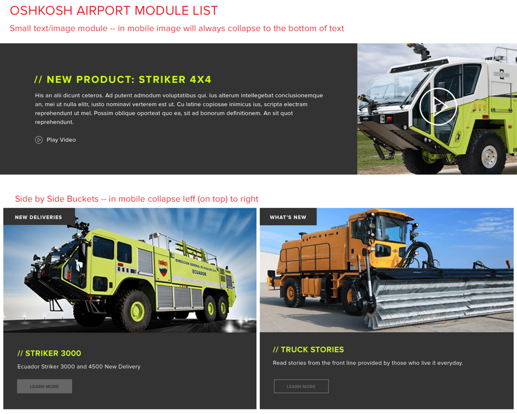
Color Comp (Photoshop) - Module Page
In our process, once color comps have been approved, development begins in Hubspot.
As we've discussed in previous blog posts,
We believe custom modules are the best way to empower Marketing Professionals to design pages to meet their needs, without having to contact their agency or developers.
To help understand the power and flexibility of custom modules, below are just a few of features that were implemented on one of Oshkosh Airport Products Category Pages.
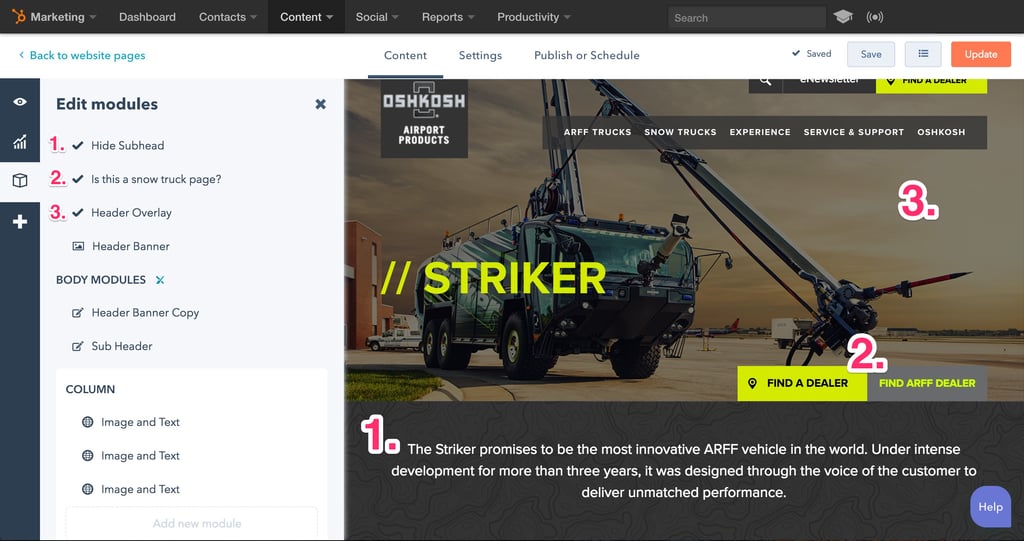 Customize pages with one-click
Right off the bat, Oshkosh Airport Products staff can choose from the following options on-page:
- Hide Subhead - This feature allows the user to turn off the gray subhead area under the main header image.
- Is this a snow truck page? - This feature allows the user to designate this page as a Snow Truck page. Once activated, the color scheme of the page switches from lime-green to orange to signify the page belongs to the Snow Truck section.
- Header Overlay - This feature ads a gray overlay over the entire header area to ensure the headline text always has proper legibility.
Moving further down the page, the Flexible Column area allows Oshkosh Airport Products the ability to add as many custom modules as they need to complete the page.
The following screen shots shows one of the eight custom modules developed for this site...the Image and Text module.
 Custom Image and Text module
A few of the features within this module include:
- Background Color - This feature allows the user to choose the background color behind the text area.
- Image Position - This feature allows the user to select if the image displays on the right or left.
- Mobile Layout - This sets whether the text or image shows up on top on mobile devices.
- CSS Class - This is just a text box that users can add a class to add custom styling to this module.
By dragging-and-dropping custom modules in any order or arrangement, Oshkosh Airport Products team can achieve endless layout combinations on each page while still maintaining brand consistency.
Results
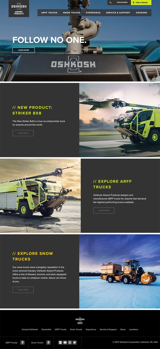
New Home Page
Here is what Oshkosh Airport Products had to say about their new site:
"Our new website is able to better convey our products to customers on a variety of devices. Stream Creative was able to make the website visually stunning while still making it simple to update pages with content and create new pages as our product portfolio goes. The process to overhaul the website was smooth and continued support keeps us on the cutting edge, just like our trucks."
Additionally, during the first three months since launch, Oshkosh Airport Products has seen a 1,133% increase in leads compared to the same period in 2016.
Conclusion
At the beginning of this website redesign project, it was our hope to create a website worthy of their industry leading equipment. Now that its launched, we believe they have a website that stands out from their competitors and accurately reflects their position in the airline equipment industry. As their tagline states, Oshkosh Airport Products will continue to "Follow no one".
