There's a famous scene in Rocky II (easily the greatest movie of all time), where Rocky's manager Mick explains how they're going to beat the champ, Apollo Creed.
"...first you gotta get speed, demon speed, speed's what we need, we need GREASY...FAST...SPEED!"

This scene popped into my head this morning as I read Twitter launched a new, speeder mobile experience they are calling Twitter Lite. My first thought was, why does Twitter need to be faster...it's already only 140 characters!
This announcement highlights the extraordinary lengths companies are beginning to take to design for mobile first...and with good reason. According to a recent Hubspot survey, 33% of their respondents use their smartphone as their primary device for internet use.
With this in mind, what can you do to make your content load faster for your audience?
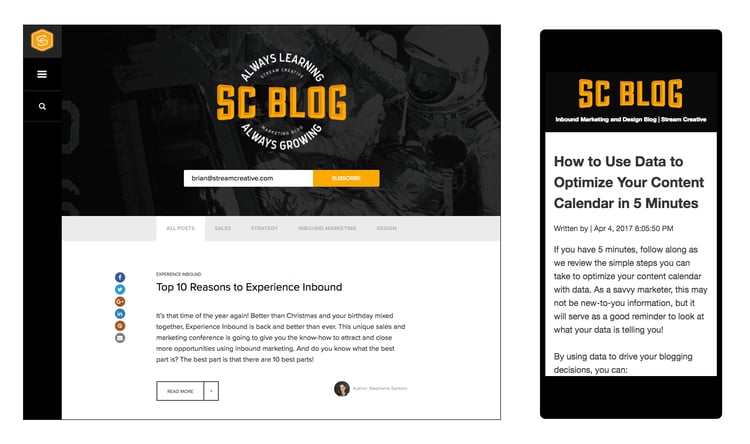
One solution is to implement Google AMP on your website. Long story short, AMP (Accelerated Mobile Pages) is an open-source initiative to improve mobile user experience by prioritizing text-based content. Basically it removes slower loading elements of your website (like JavaScript) to load pages near-instantaneously.
If you're a Hubspot customer, turning on AMP for your blog is easy. Below are step-by-step instructions on how we implemented AMP on our Hubspot blog.
- Log-in to Hubspot
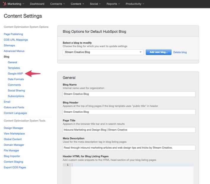
- Navigate to Content > Content Settings
- In the left navigation Select Blog > Google Amp

- (Optional) Customize the Settings to match your website*. The following video outlines the settings modifications we used.
- Click Save Changes


