Making a bad first impression can be the difference between attracting new business or losing out on an opportunity. With your competition only being a click away online, it’s important that your website immediately presents your business in a way that matches your expertise and professionalism.
 With that being said, your homepage is the most important part of your website because it gives off the first impression of your business. It is typically the most visited page on your website. It is the easiest remembered URL. It shares your mission, values, and goals – and should quickly communicate to your audience how your product/service addresses their needs. A variety of different traffic types come to your homepage, so it needs to cater to every one of your buyer personas.
That’s a lot to ask of one page!
To make sure you have the best homepage possible, with a lasting impression, we’ve outlined 9 steps that need to be taken. Go through these steps and make sure you have completed each of them.
1. Set your goals. (Most crucial step.)
- What is your website about? How can you educate your audience?
- Aim to get users beyond the homepage.
- Use measurable goals to track performance.
- Incorporate calls-to-action to show the next steps. Don’t let a user self-direct. Take them down the path that helps them make an informed decision.
2. Create content.
- Homepage content is your business value proposition.
- Focus on one primary, long-tailed keyword. What words/phrases is your audience searching for to find your product or service?
- Use headlines and bullet points. Make your content easy to scan.
- Split content into columns – no more than 4.
- Have whitespace, so you don’t overwhelm the visitor with content.
- Use internal links to help guide through the website.
- Add relevant, small images.
- With big images, layer them with text as a call-to-action.
- Overall, educate the visitor.
3. Optimize the page for Search Engines (SEO).
- Make the page unique by using one main keyword that describes your business.
- Add the primary keyword to your:
- Page title
- Meta description – a CTA (call-to-action), up to 150 characters.
- Headlines – H1, H2, H3 (only have one primary headline (H1))
- Content – should be “above the fold” with bolding and bullets
- Images – file name and alt text (alt text describes the image to search engines and is used for screen readers for the visually impaired)
- Anchor text links (the actual text that gets hyperlinked. Use a keyword instead of phrases like “click here.”)
4. Create an eye-catching header.
- The simpler the better.
- Use your logo.
- Include your phone number.
- Add courtesy links in top right for quick navigation.
- Add a login link – if needed.
- Have a consistent header throughout the whole website.
5. Build the menu/navigation.
- Make it big enough so that it can be seen from 5 feet away.
- Use a clear font for easy reading.
- Keep it consistent across the website.
- Have descriptive short menu headers.
- No more than 8 menu headers going across. 5 or 6 is an ideal number.
- Again, keep it simple and clear.
6. Include Calls-to-Action (CTA).
- You have 3-5 seconds to engage the visitor – use CTAs to attract and engage.
- Each CTA should appeal to a different visitor type.
- Not all need to go to landing pages. Some can point to blog posts, for example.
- Incorporate A/B testing – use 2 different CTAs and test them against each to see which receives more clicks.
- Look at your analytics to see which CTAs are the most effective.
7. Incorporate social media.
- Add a CTA to join your social networks – assuming you’re active in social media.
- Add follow and share icons in header and footer.
- Be descriptive and show reason and value to join.
8. Create a footer.
- Include company legal name and copyright year.
- Add contact information and important links. Users often use the footer as an active site map.
- Keep it consistent throughout the website.
9. Continuously test your homepage.
- Are you reaching your goals?
- Did the goals change?
- What can be added or adjusted?
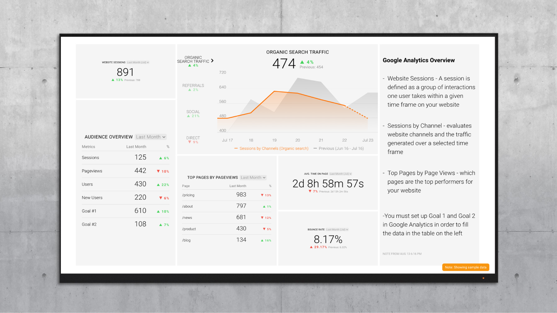
Our last overall recommendation: look at the data and adjust. Using a tool like Databox (We are a proud Databox Partner and affiliate, we receive commission on purchases made through links on this page.), you can set up monthly marketing dashboards, which allow you to evaluate your most important KPIs -- across multiple platforms -- in a single data dashboard. Add annotations, notes and send a live link of your data report to your marketing department, client or C-Suite, highlighting your successful homepage optimization. Use the Google Analytics Website Performance dashboard to benchmark your website data now, and check back monthly to see how your optimizations are working for you.
Make your website remarkable and stand out against the crowd by implementing these steps, if you haven’t already. Make that first impression a lasting impression that will continuously bring people back to your site, and hopefully turn the visitors into leads and customers.
Is your website optimized?
Bonus Google SEO Tutorial: How HubSpot Uses Blogging to Rank #1 on Google
Learn the three major strategies that HubSpot employs to rank for target keywords in Google search results. Check out this free lesson from HubSpot Academy. (Note: We are a HubSpot affiliate and receive a commission if you purchase any HubSpot products)


